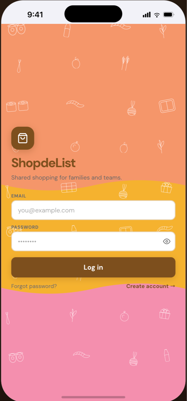
ShopDelist
Designing a smarter shared shopping experience for families
PROJECT OVERVIEW
solo founder, designer and developer, personal project, built with React Native and Expo.
The Problem
Every week, my husband and I ended up at the grocery store at the same time — texting back and forth, buying duplicates, forgetting things. It was frustrating for something as simple as groceries.
A few shared list apps existed. But their AI felt bolted on — voice commands nobody used, chatbots that hijacked the experience. Real users were leaving Listonic specifically because of an AI assistant they couldn't turn off.
The gap wasn't the absence of AI. It was the absence of thoughtful AI.
The goal: a shared shopping experience where AI helps when you ask — and stays out of the way when you don't.
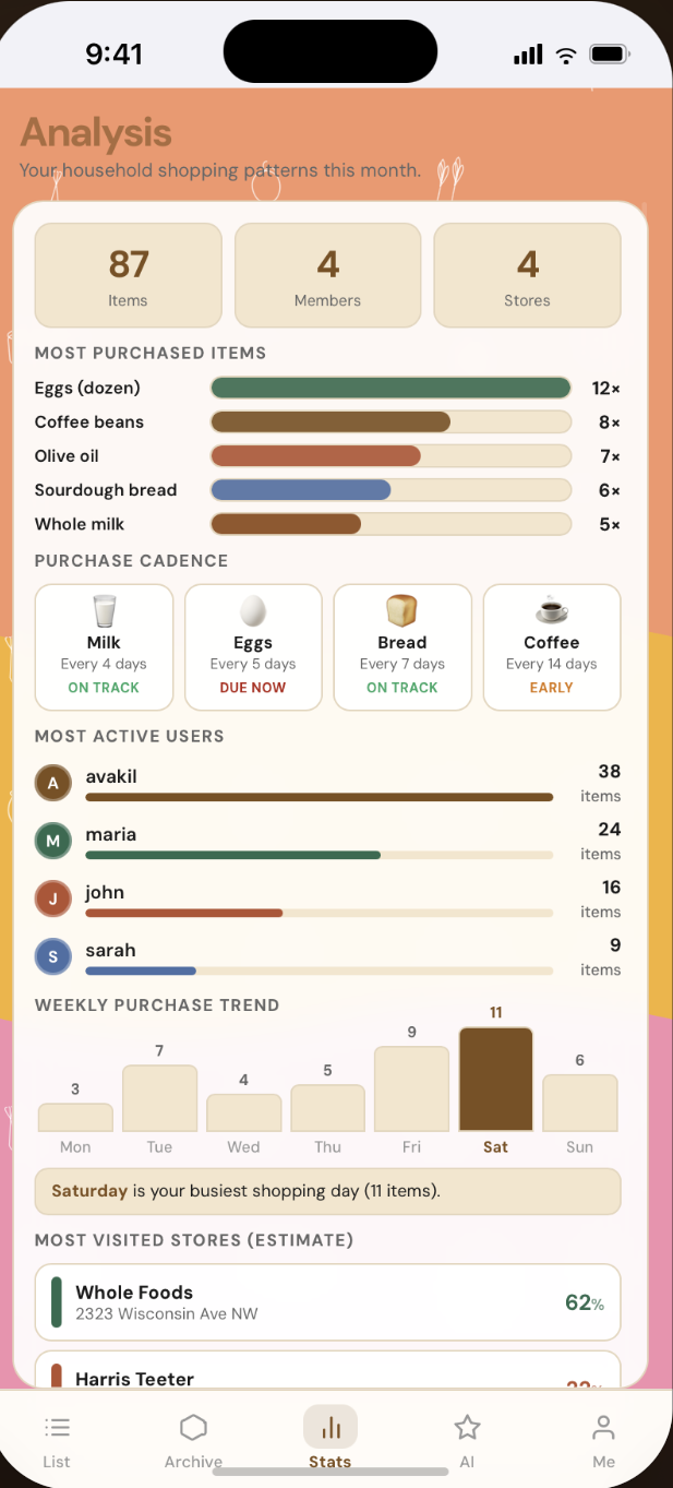
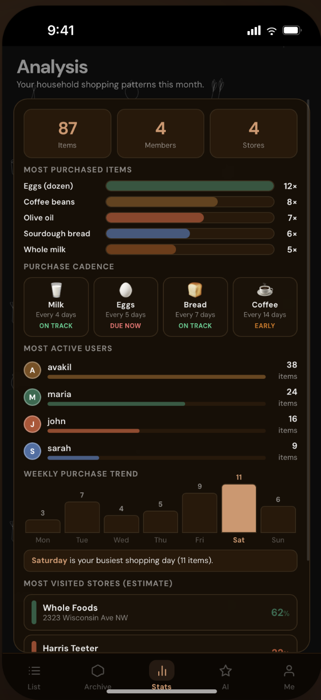
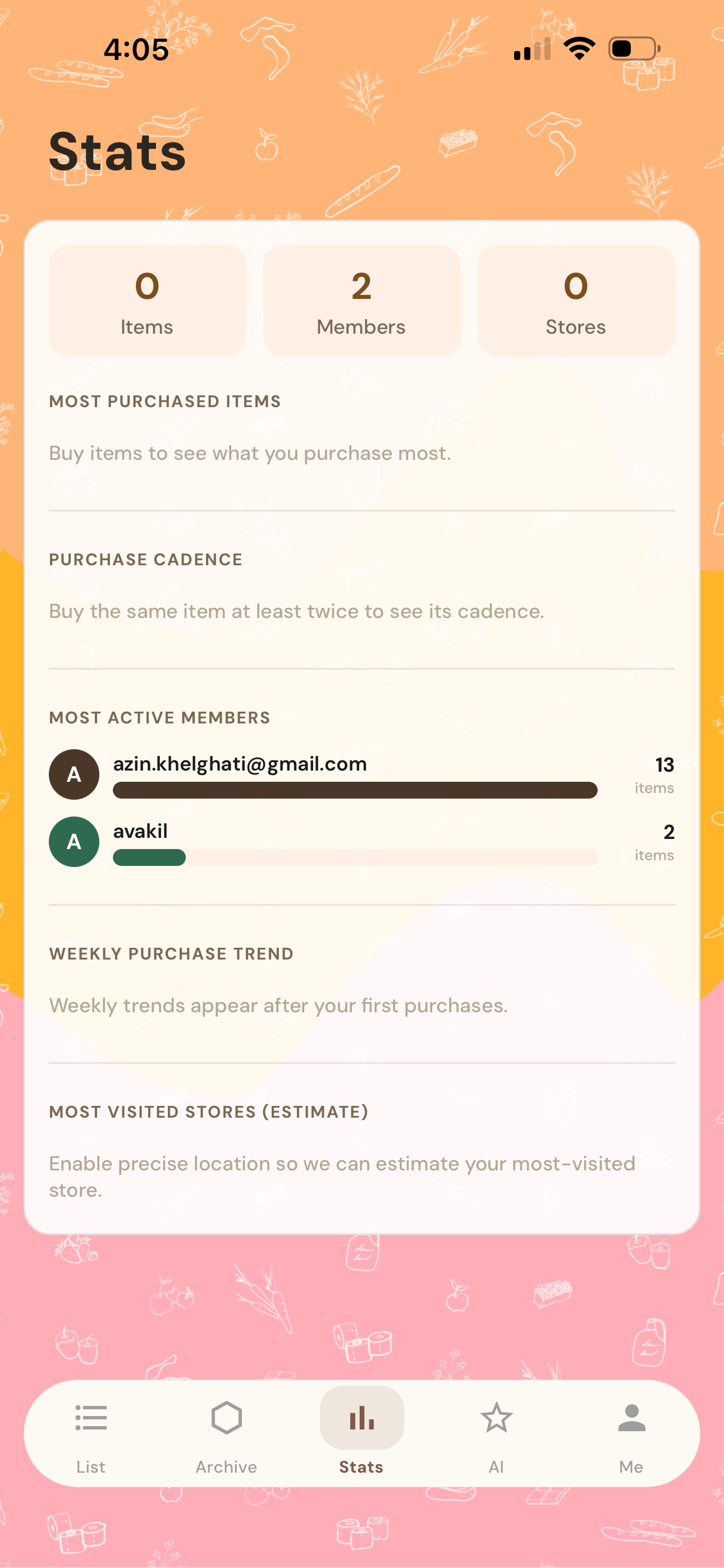
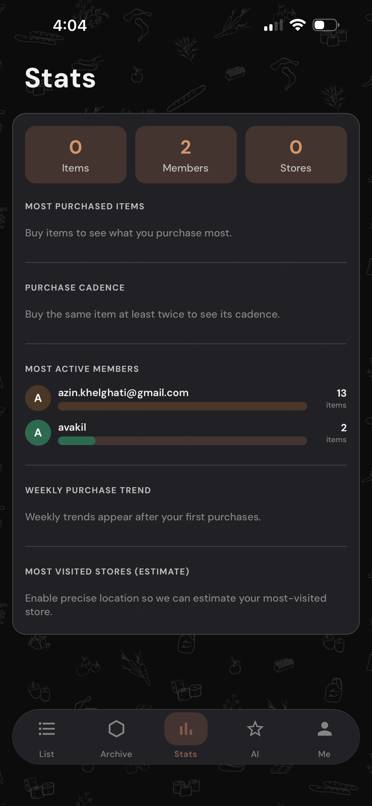
Stats
Key metrics tracking user engagement and shopping behavior, giving households insight into spending patterns, most purchased items, and list completion rates.
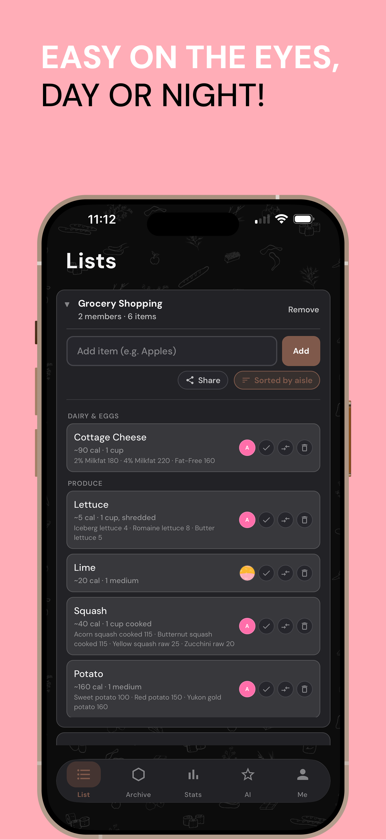
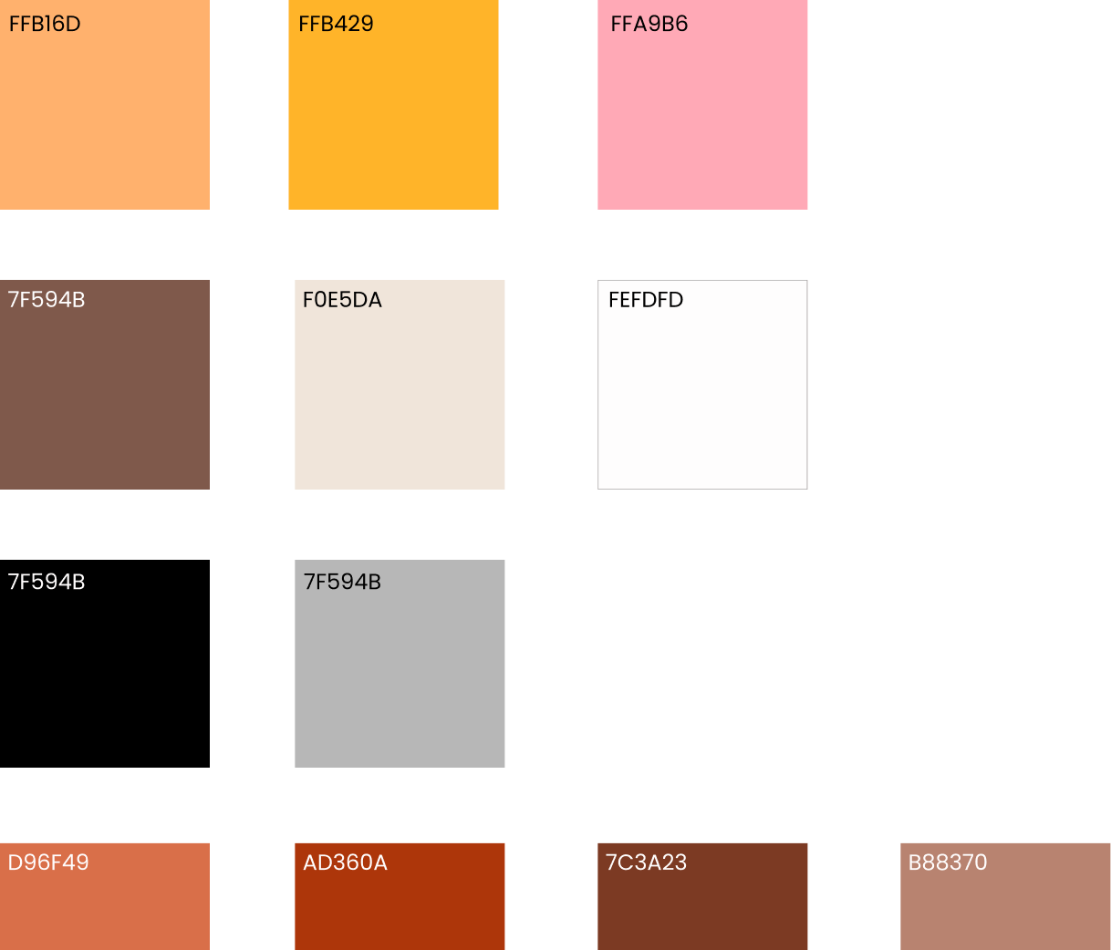
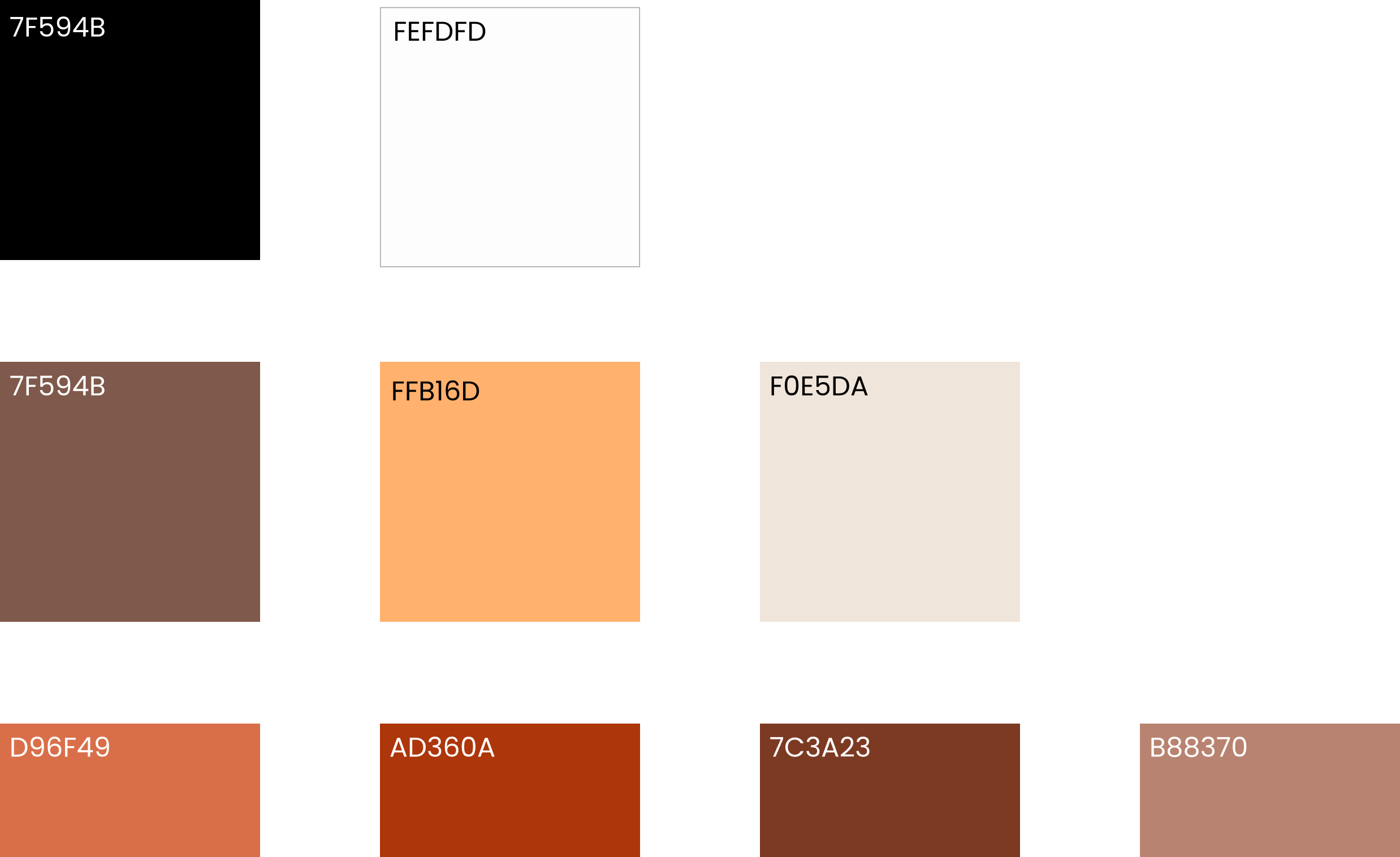
light mode color palette
A warm, expressive palette anchored in coral-orange, with saffron yellow and blush pink accents, balanced by earthy browns and soft neutrals for a friendly, approachable feel.
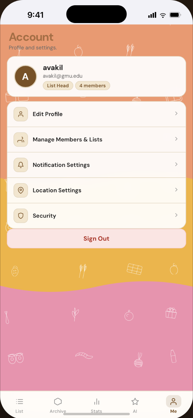
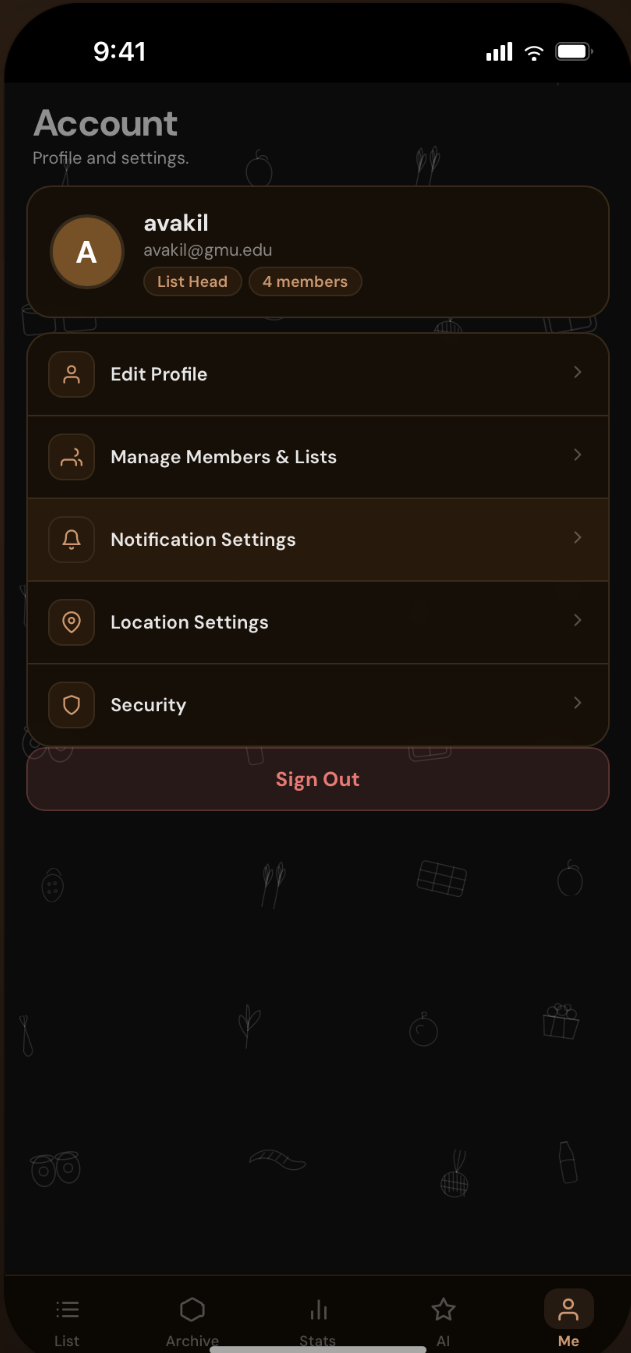
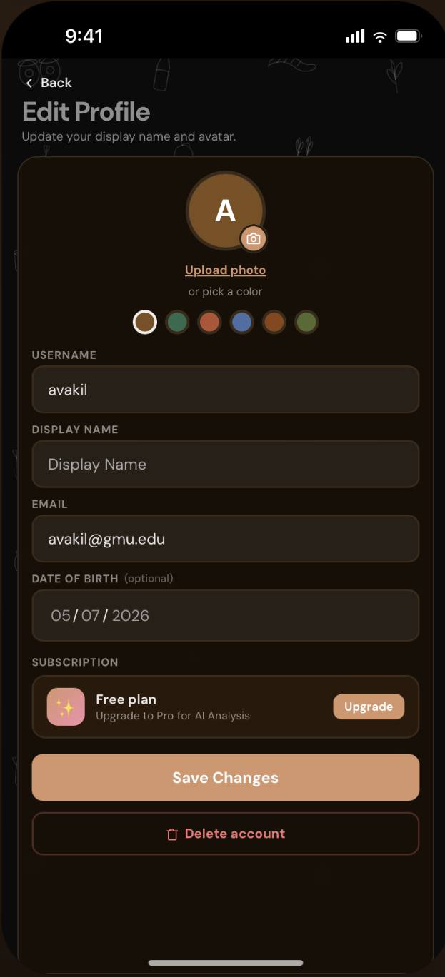
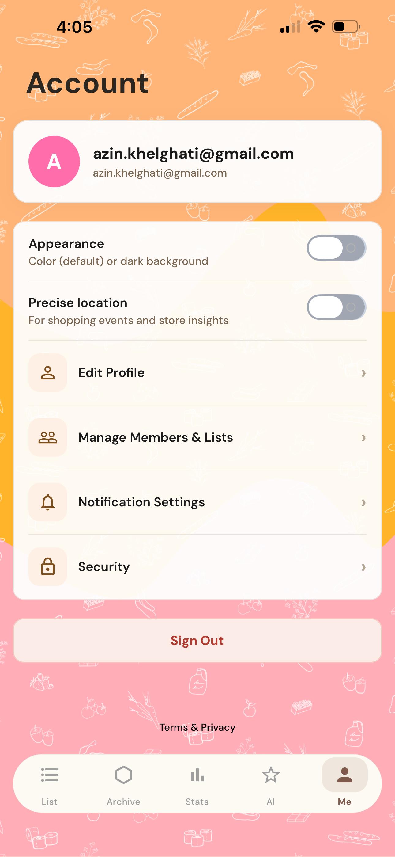
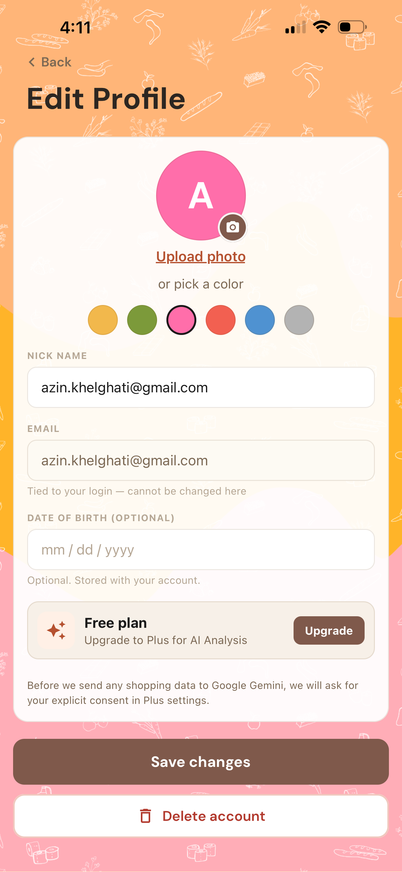
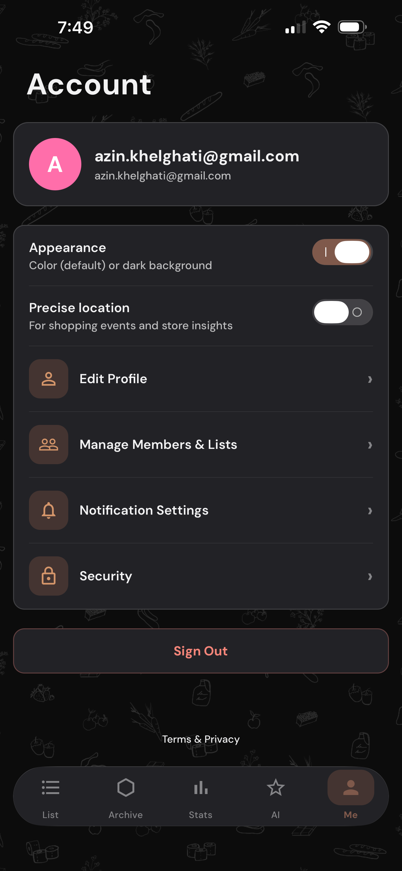
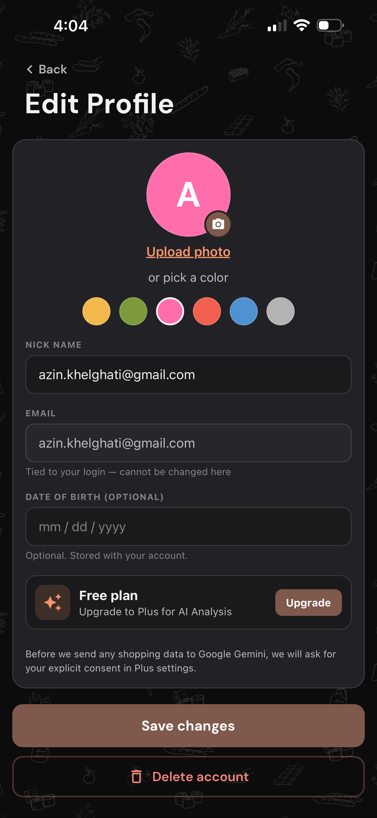
ME (profile)
Exploring ShopDelist's visual identity through hand-drawn grocery illustrations and three color directions — warm coral-orange, analogous golden tones, and a dark palette. The side-by-side comparison led to adopting coral-orange as the primary theme, with dark mode retained as an alternative for low-light use.
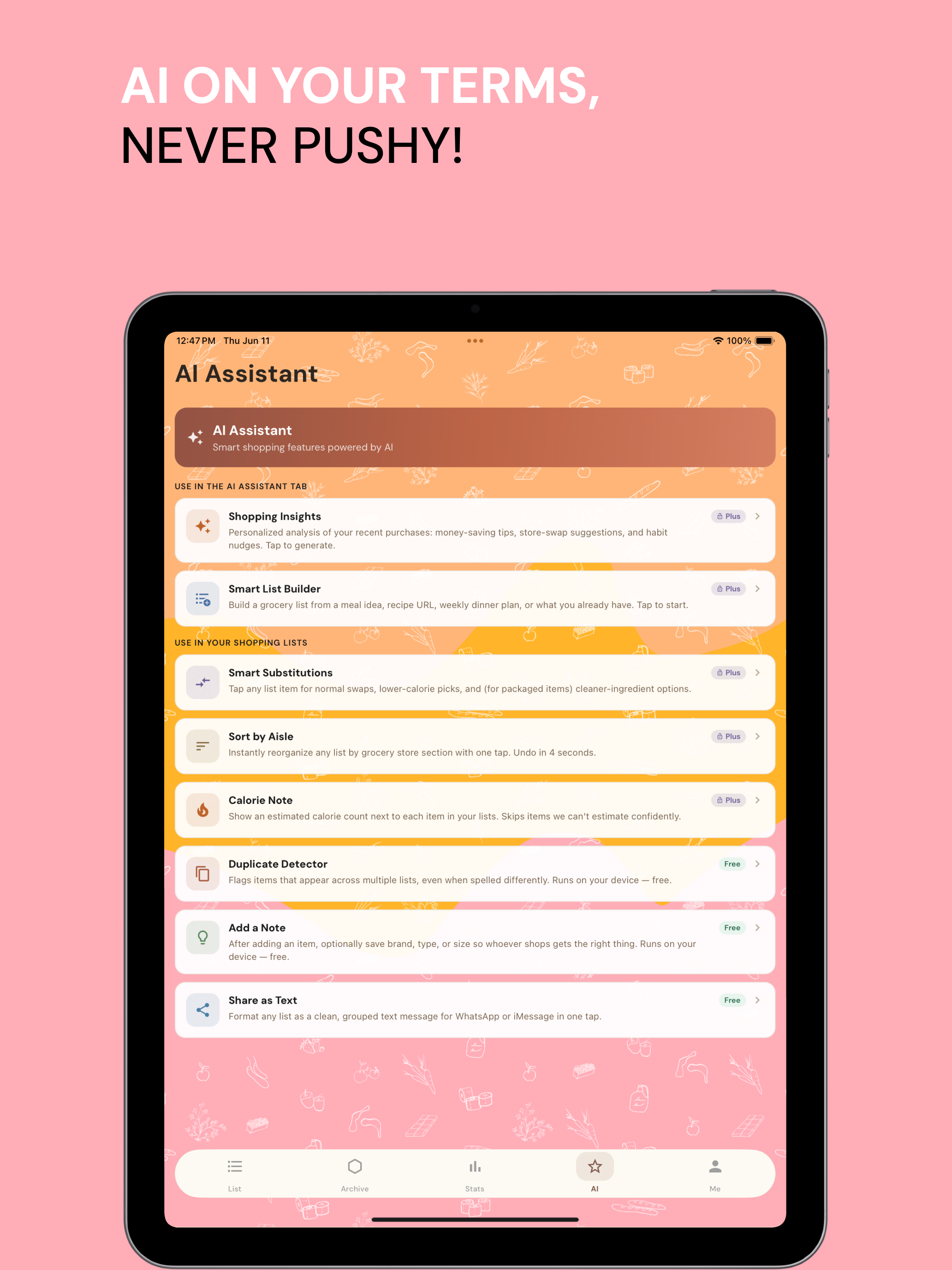
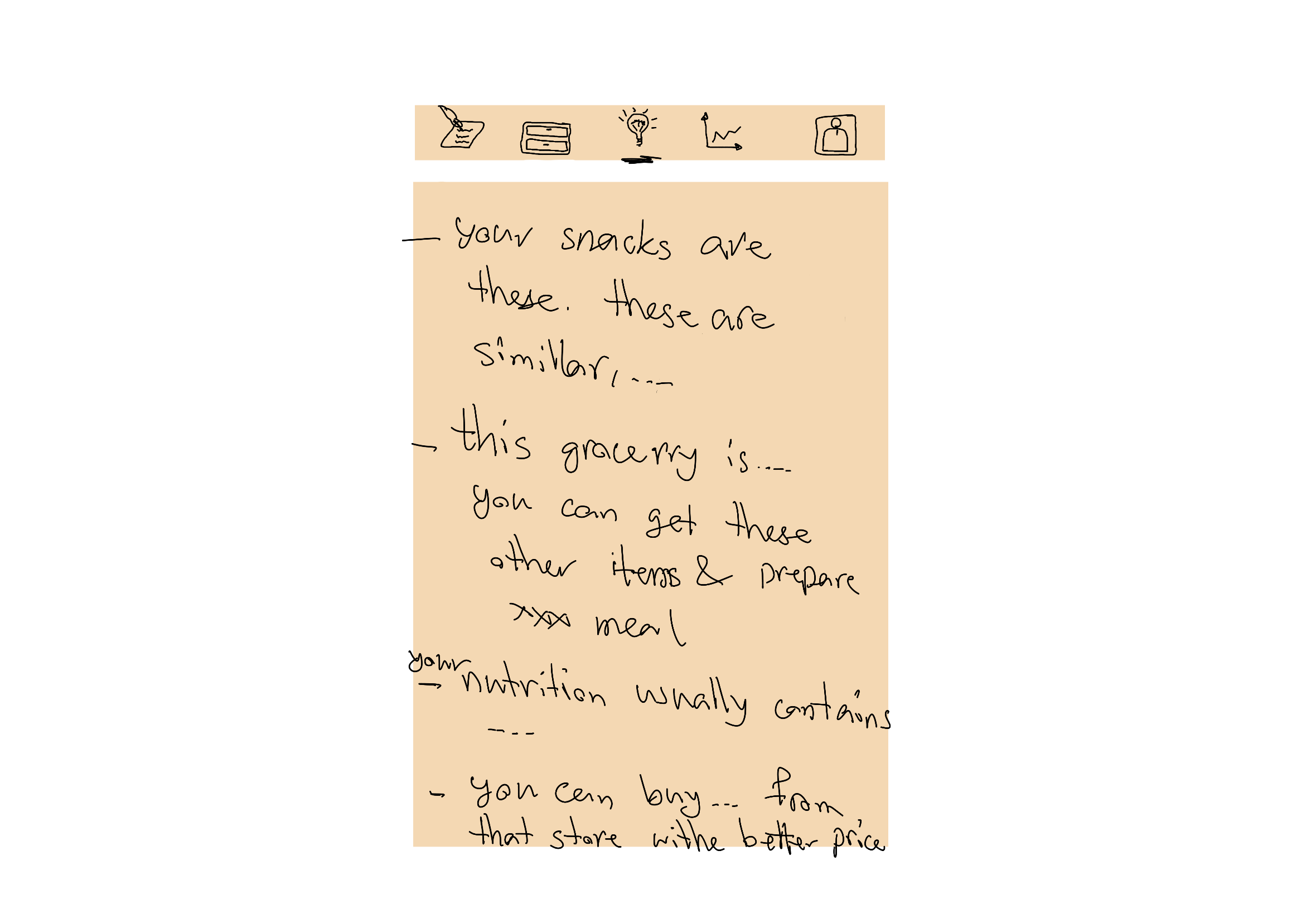
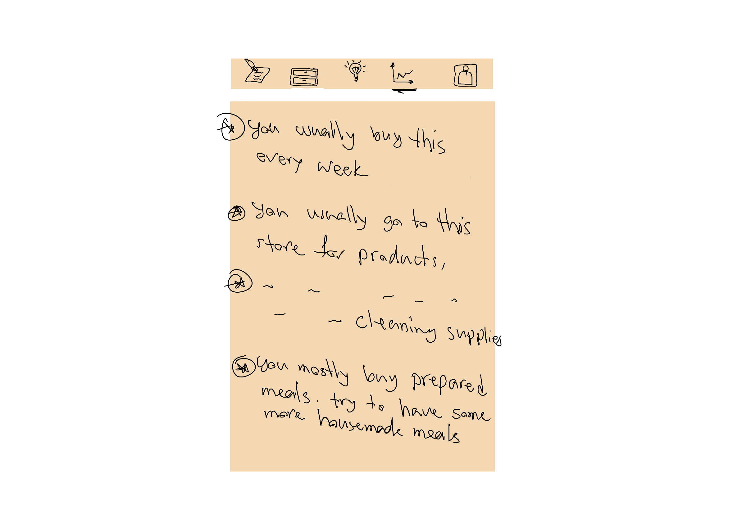
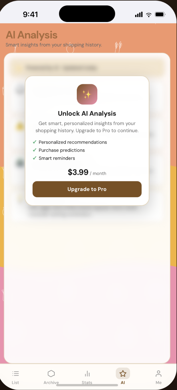
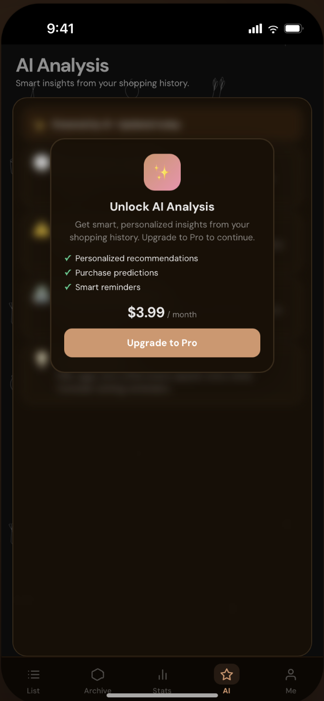
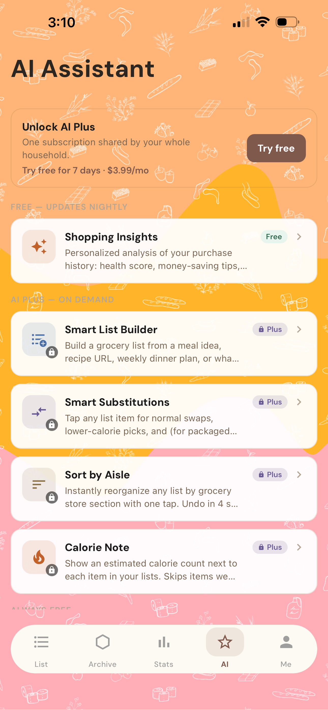
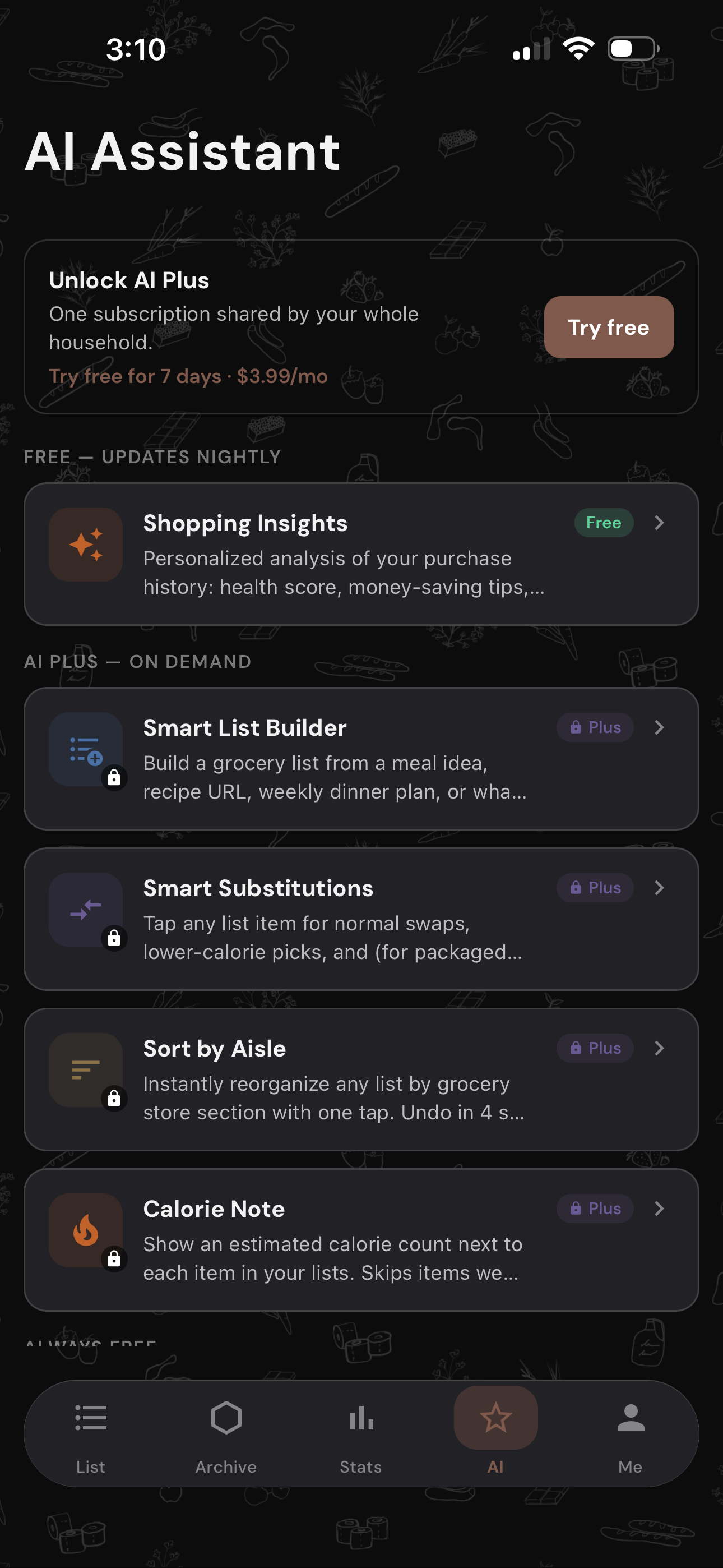
AI
The AI feature activates only when the user requests it, keeping the experience clean and uninterrupted during regular shopping.
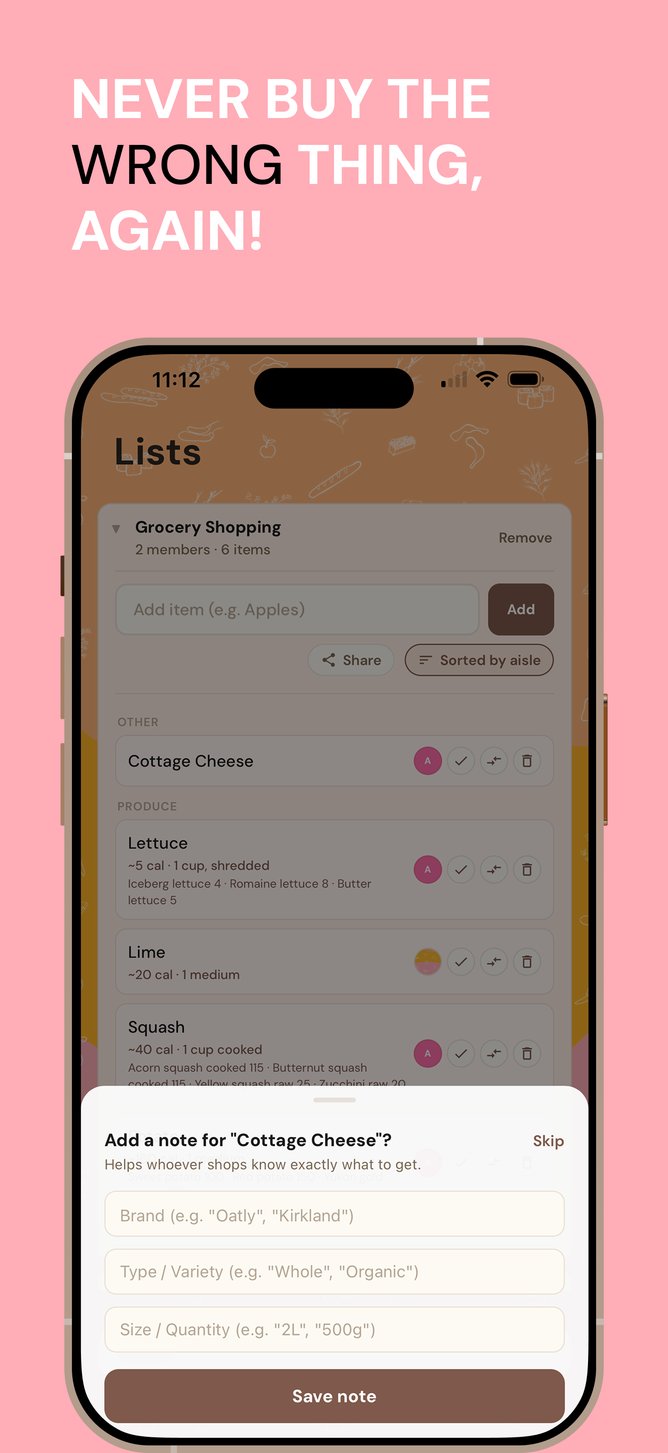
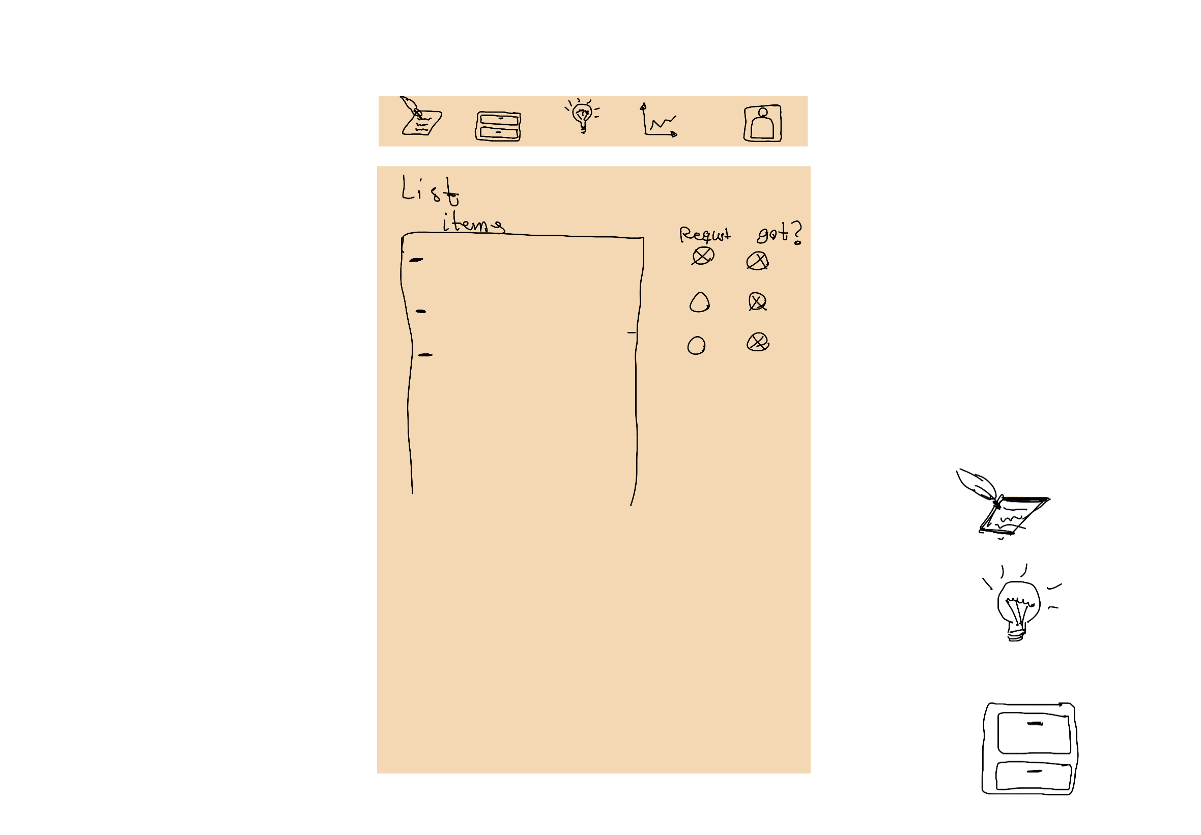
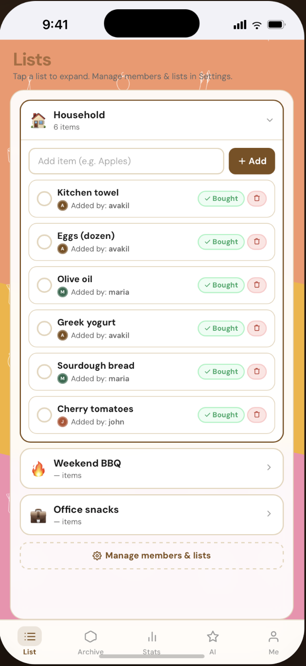
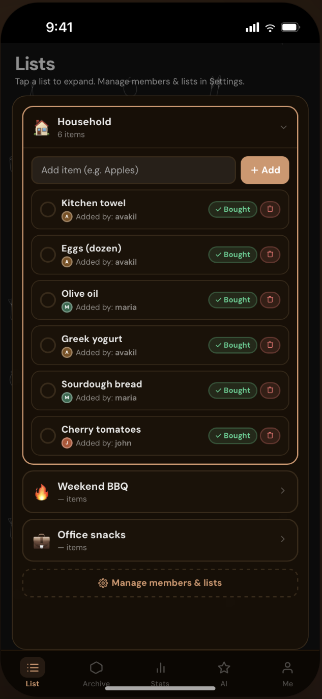
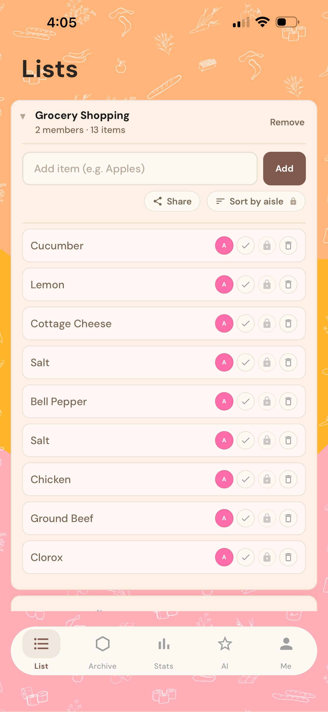
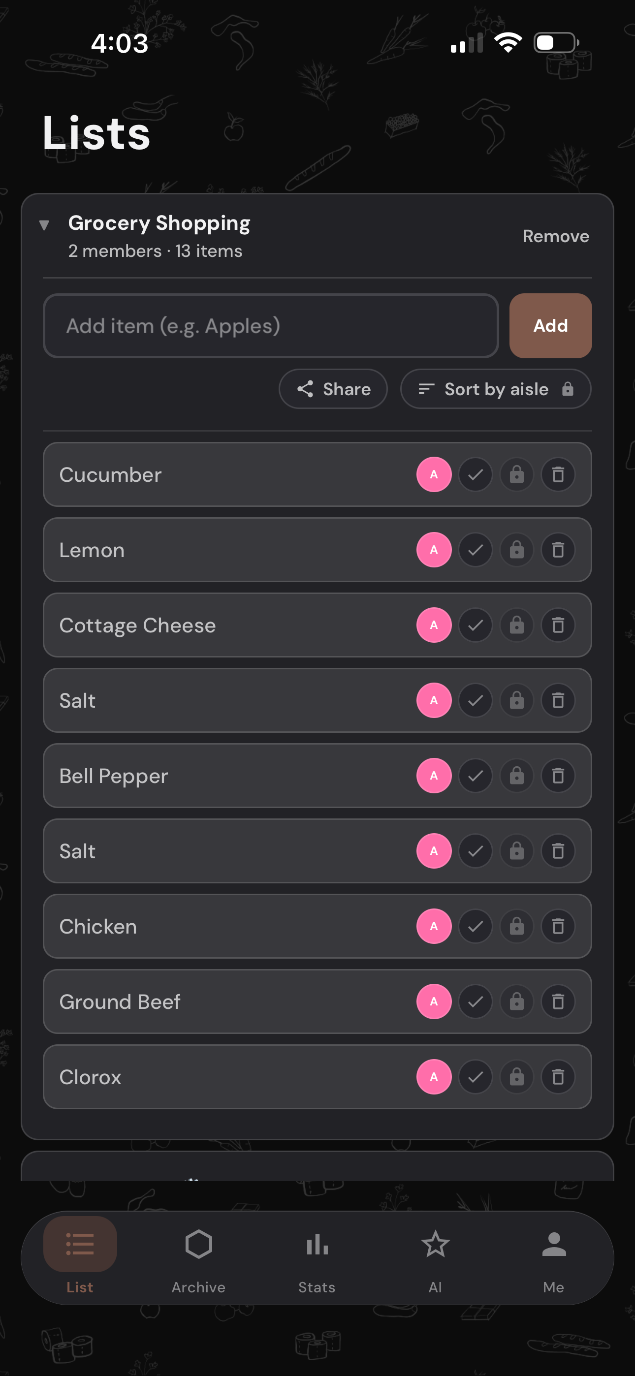
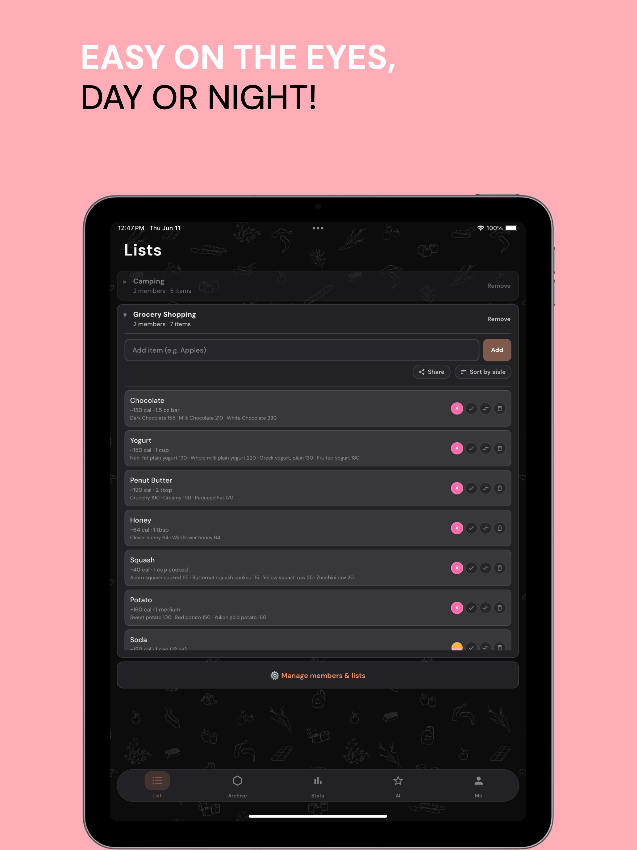
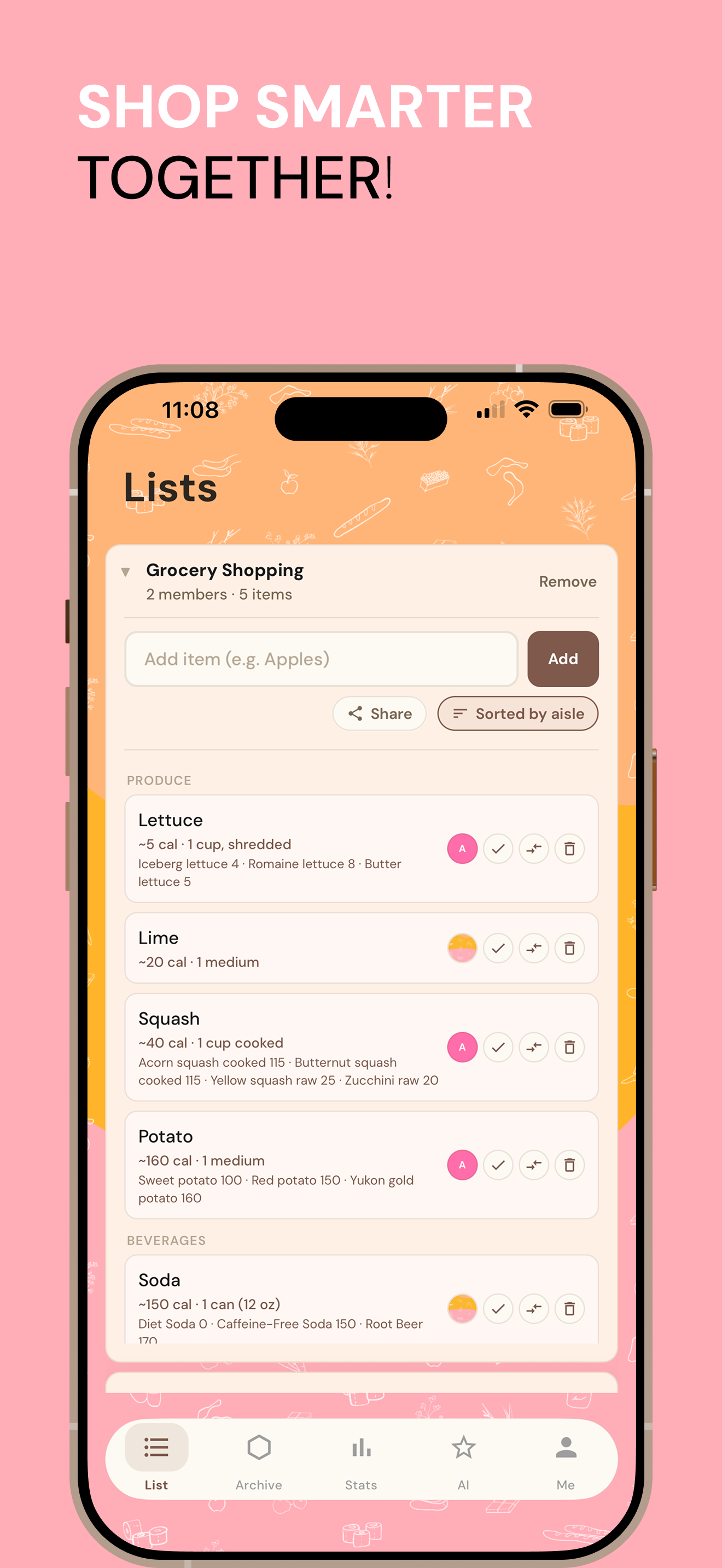
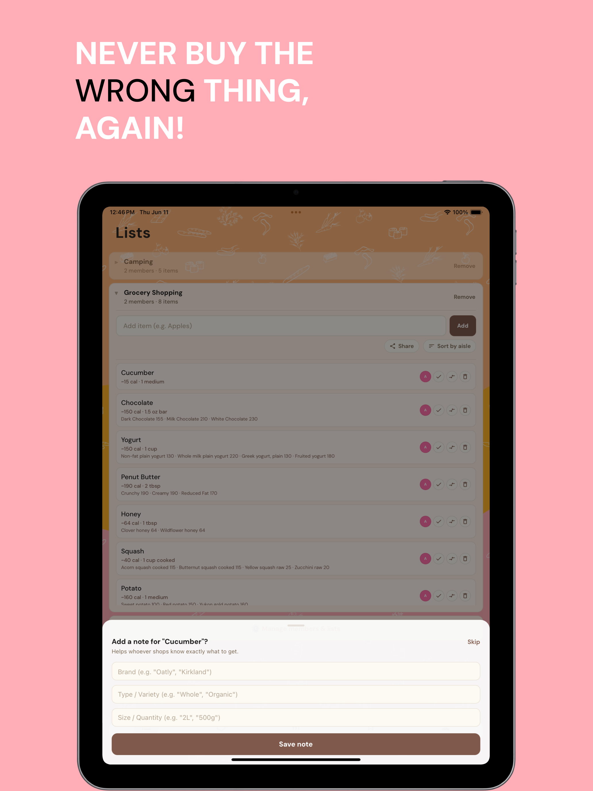
LIst Tab
The main hub of the app where household members can add, check off, and manage shared grocery items in real time.
Lo-fi sketches mapping the foundational UX of Shop De list — a smart shared shopping list for families. These early wireframes defined the core flows: list management, AI recommendations, and household settings — all sketched before a single pixel was designed.
UX Framework & Flow
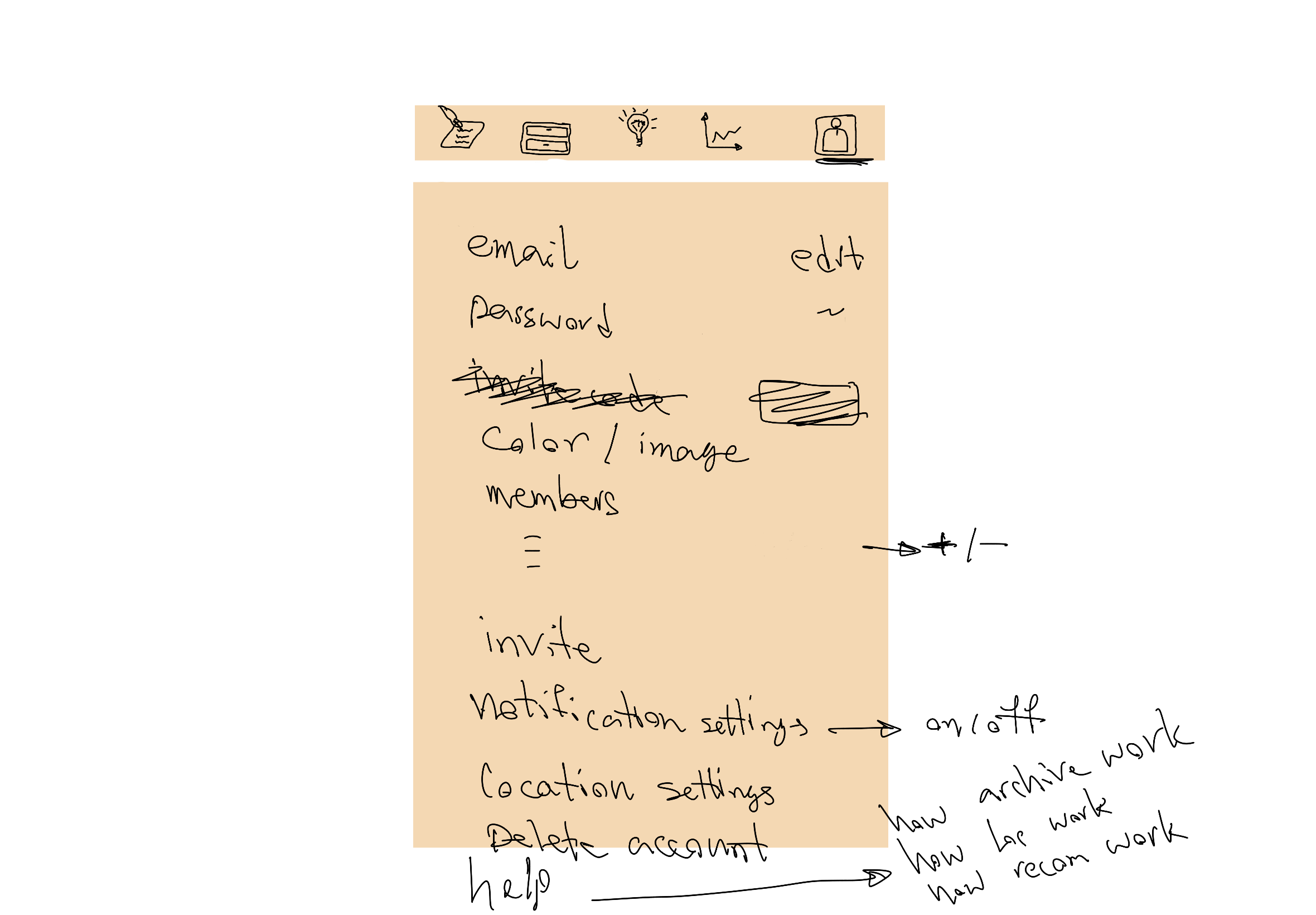
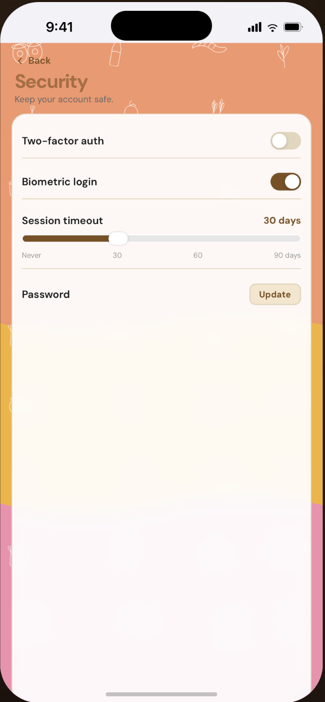
UX framework mapping all core app screens — Login, Lists, Archive, Analysis, AI Analysis, Account, and Security — across both light and dark modes. These screens defined the full interaction flow before moving into final visual design.
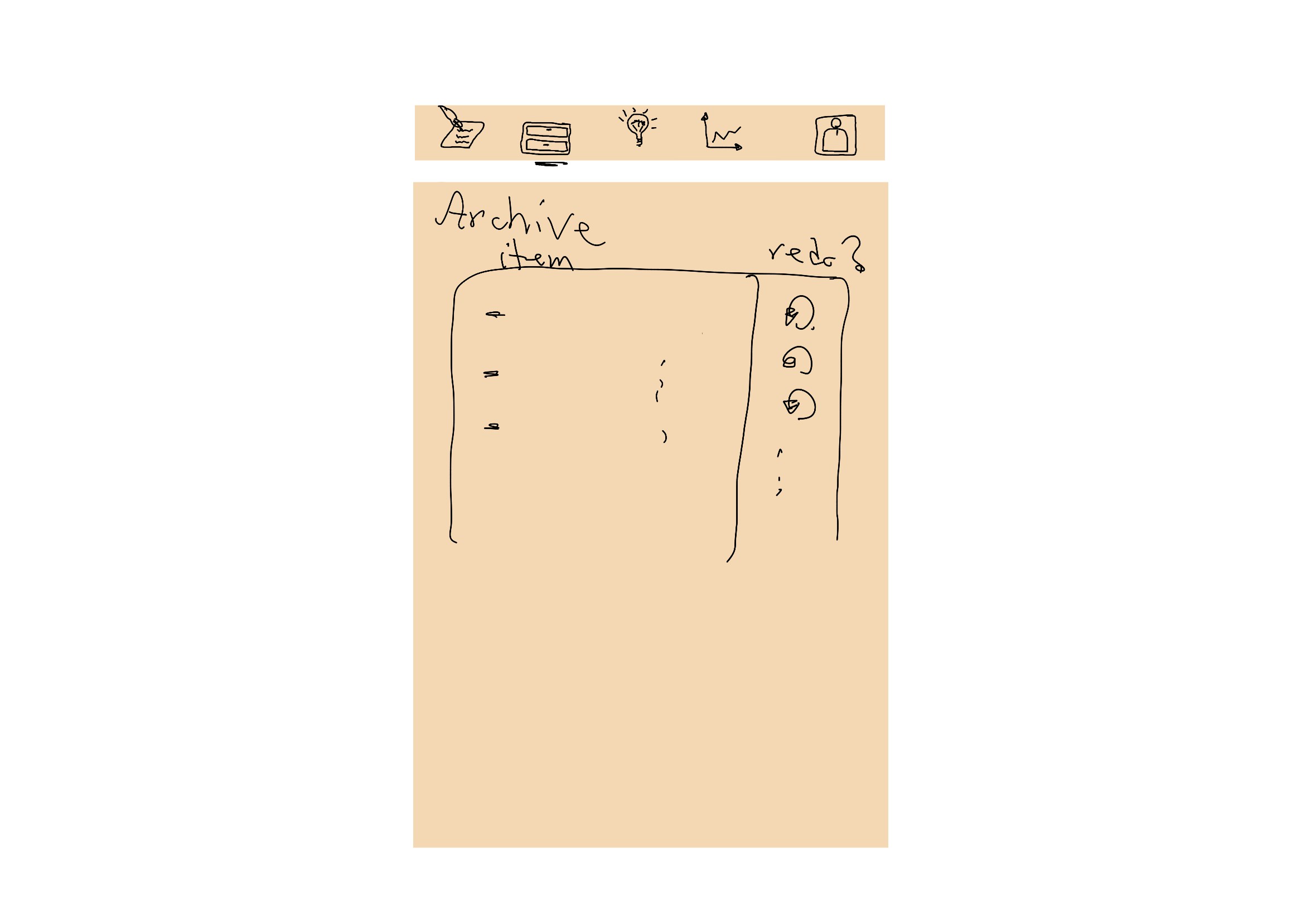
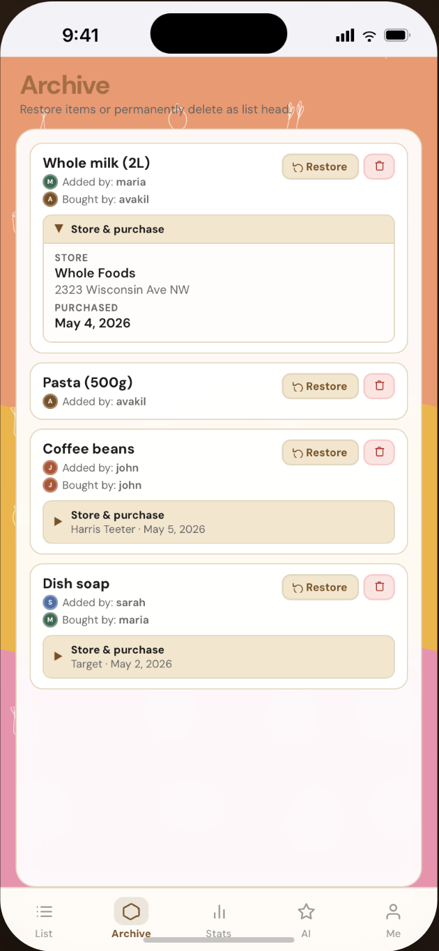
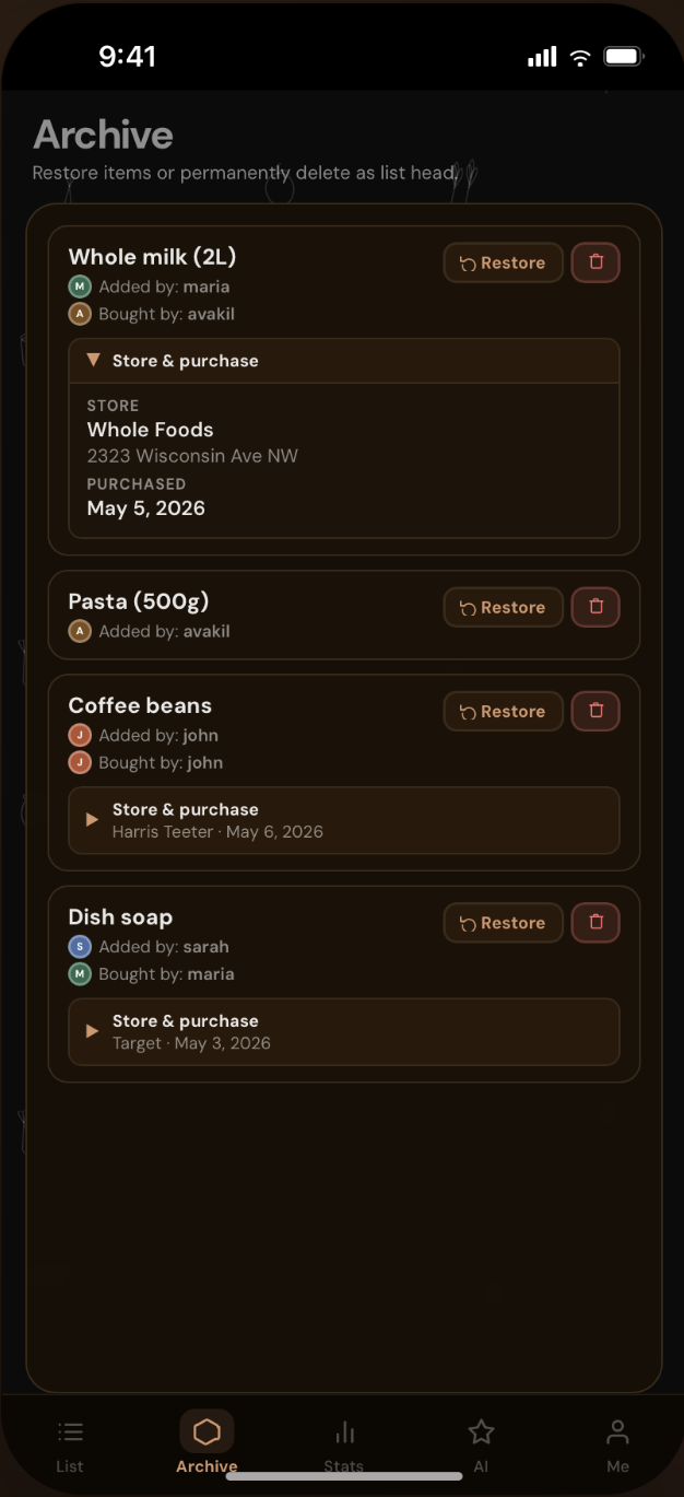
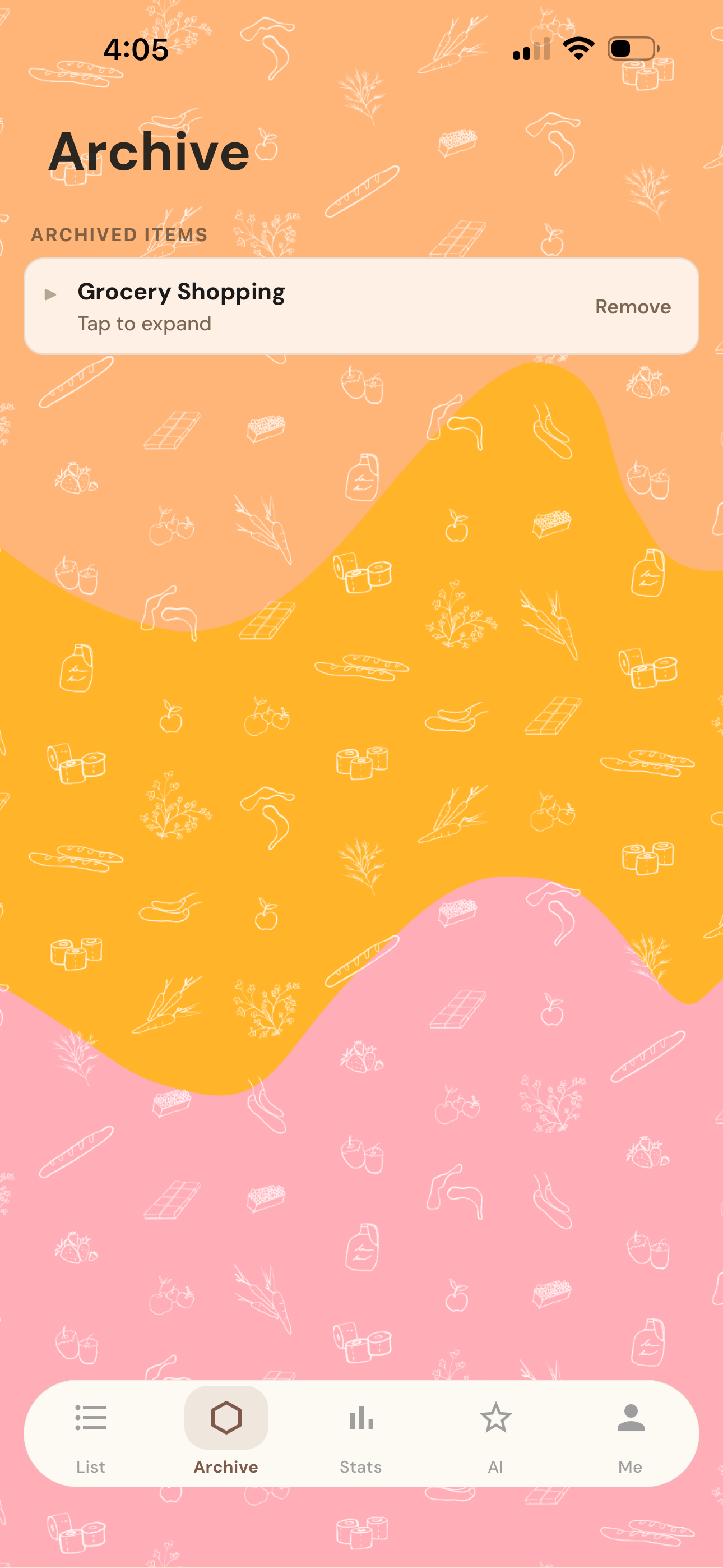
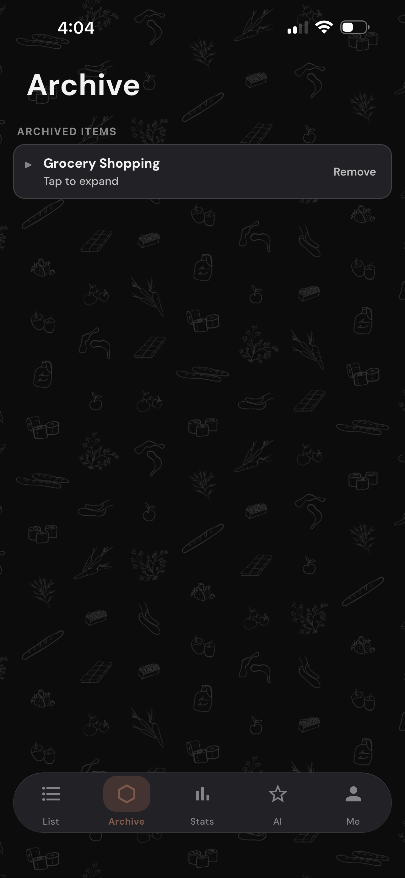
Archive Tabe
Stores completed shopping lists so users can reference past purchases and quickly re-add recurring items.

fiNAL DESIGN
Building ShopDeList as a solo founder taught me how to move from a personal frustration to a fully designed and developed product. The biggest design challenge was making AI feel helpful without being intrusive — a balance that shaped every decision from navigation structure to feature placement. The app is currently in development and set to launch in 2026.
VIsual identity
Building a cohesive visual language for ShopDeList — from icon design to color system and typography.
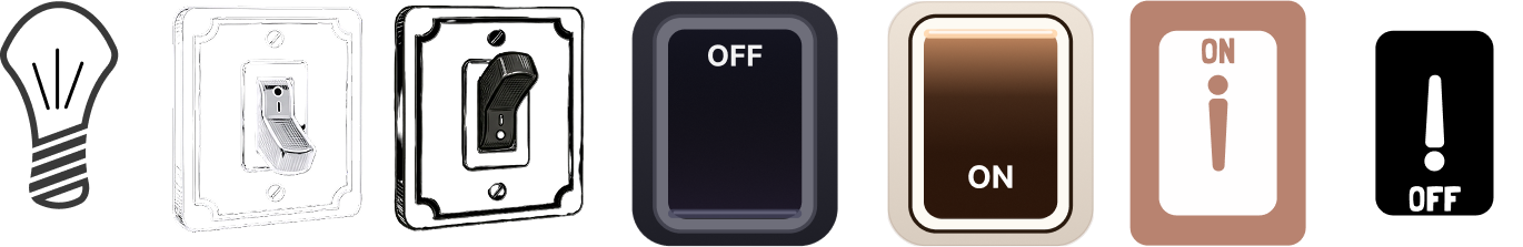
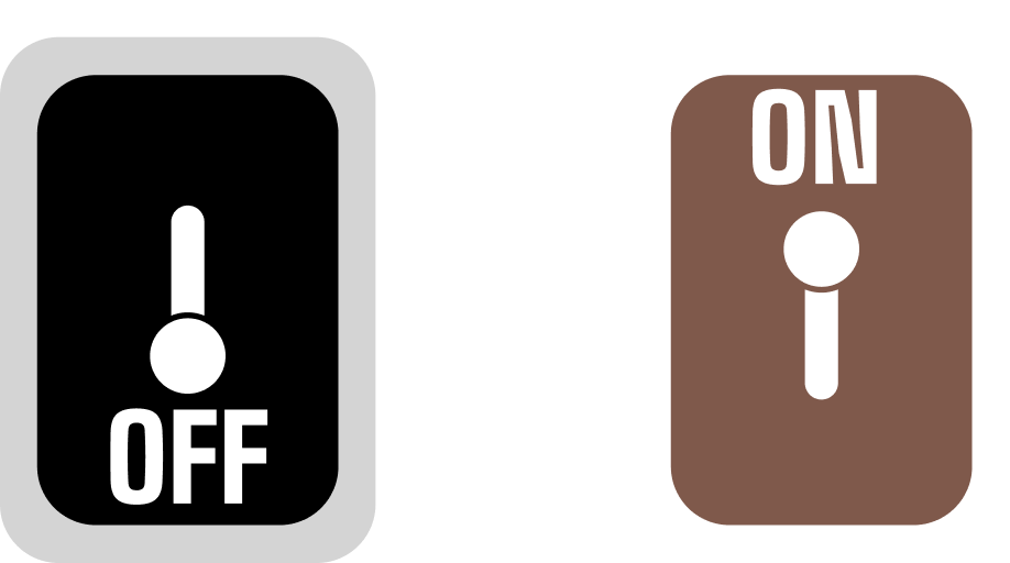
Mode Button exploration
Exploring toggle design options for switching between light and dark mode within the app.
User Research & Insights
User Research & Insights
Who I was designing for A working professional managing the household grocery routine — coordinating with a partner, carrying the mental load, frustrated that no existing app made real-time family coordination truly effortless.
What the market told me I evaluated the three dominant apps — AnyList, OurGroceries, and Listonic — through their feature sets and real user reviews. Two patterns stood out clearly:
OurGroceries users flagged a clunky multi-user experience — changes causing duplicate items, accidental deletions, and coordination confusion between household members.
Listonic users were actively abandoning the app because of a forced AI chatbot assistant they couldn't disable
The insight The problem wasn't the absence of AI. Some apps had it. The problem was that existing AI was either invisible and passive — or loud and intrusive. Neither served busy families.
Design principle:AI that activates when you ask. Silent when you don't.
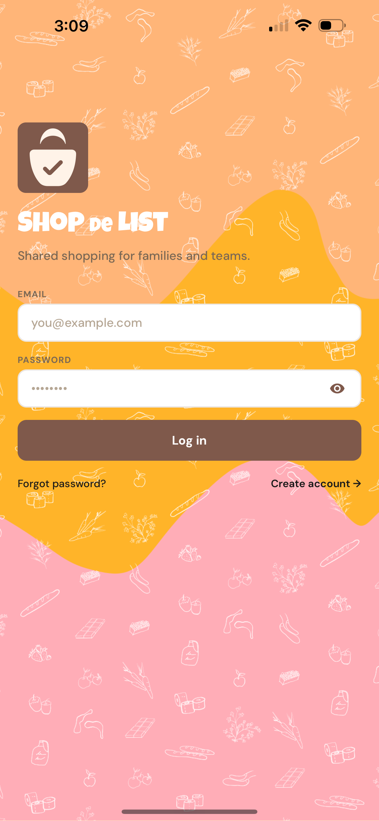
LOGO EXPLORATION
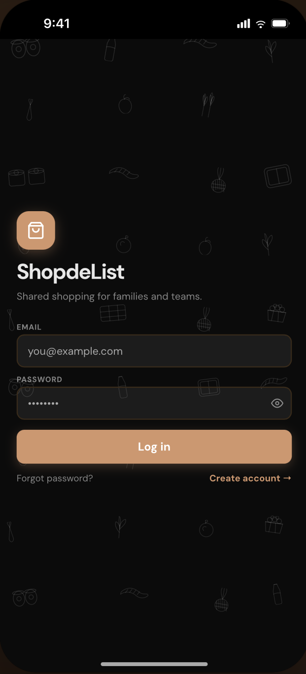
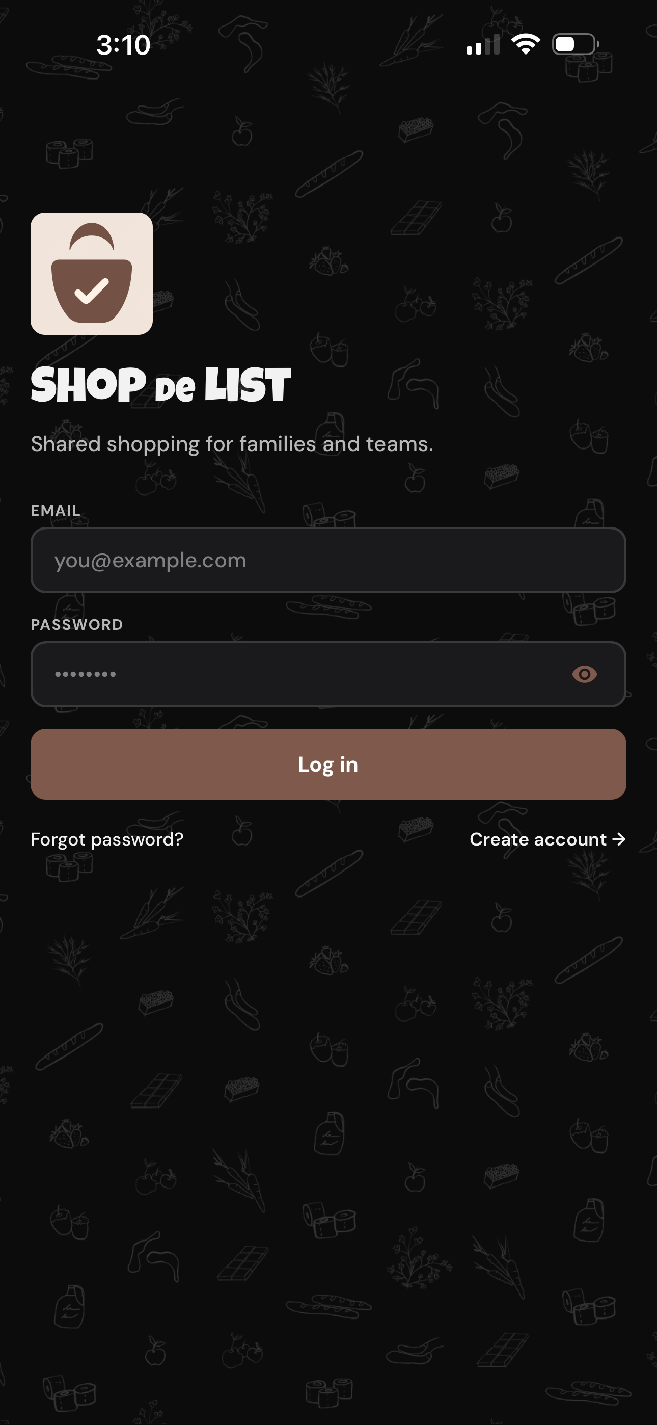
Dark mode color palette
Black base with orange and deep brown accents , maintaining brand warmth in low-light environments.
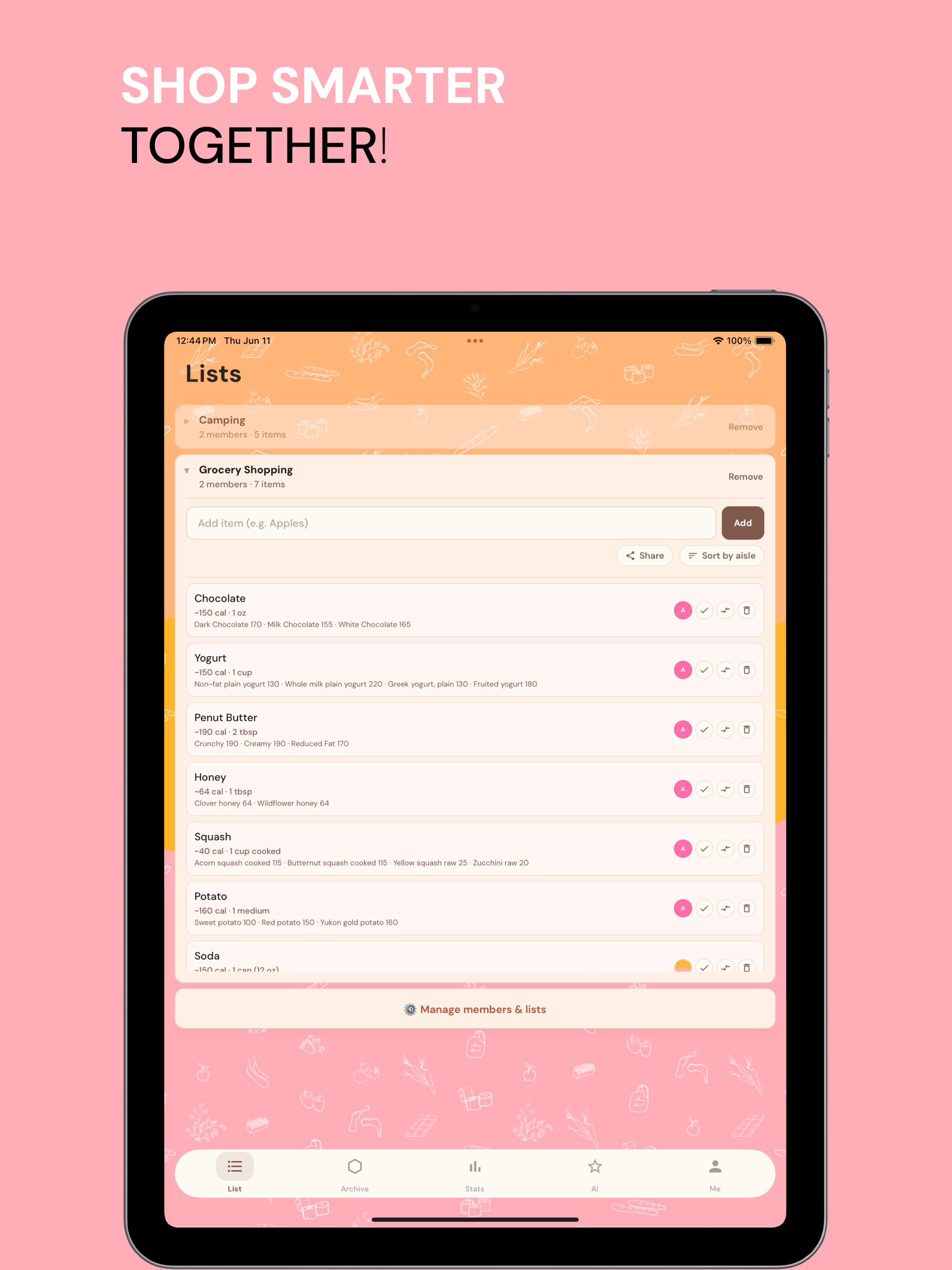
app store screenshots | IPAD
app store screenshots | iphone

google play | banner